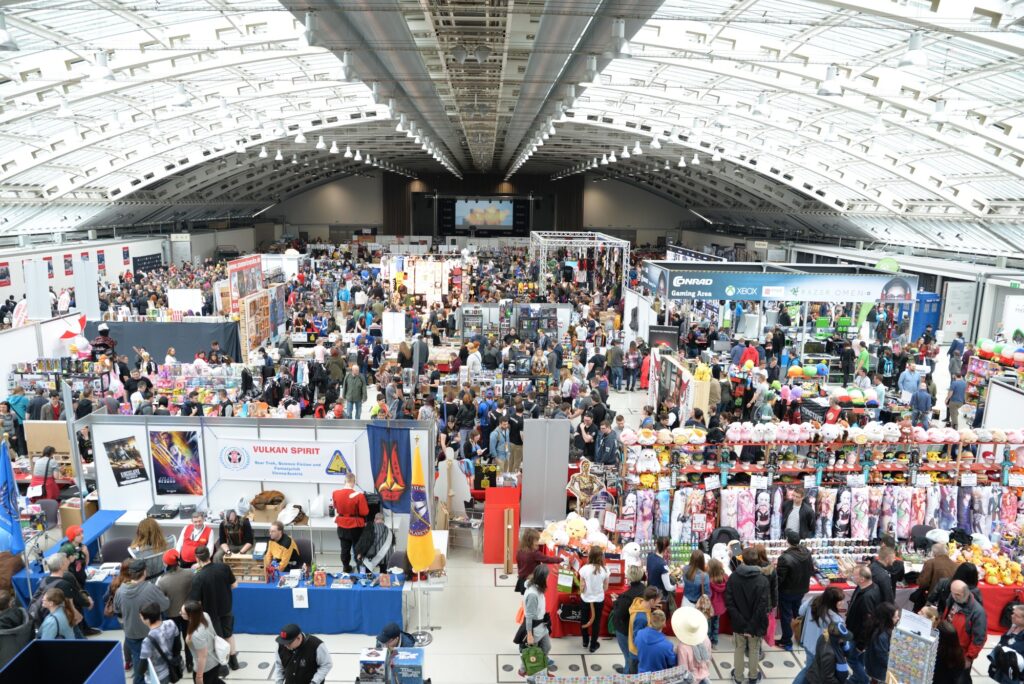
Event banners are more visually-striking than forms of advertising. They stick out on bland storefronts, sometimes catching your eye if you’re driving or walking near the venue.
A well-designed event banner will help you to reach your goals as an organizer or sponsor. Setting events apart from other events happening can help you secure more attendees and secure your success.
Event banners are a great way to get the word out without needing a costly and formal invite. They are great for social media promotions and marketing to get more attendees for your event. You can use these banners for tech events, product launches, concerts, or any other event that needs quick and cheap promotion.
Here are some design tips you will want to take advantage of before creating your event banner.
-
Choosing the Right Background Color Scheme
Bright, striking colors are a great way to draw attention to the banner. Consider tones that match your theme or event branding for a more subtle approach. You want to make sure that your flag is visible and inviting.
Avoid busy patterns or overcrowding of colors, as this can overwhelm people. Test out different color combinations to make sure the design is eye-catching and easy to read.
Also, consider adding a few images or attractive visuals to make the banner reflective of your event. Combining the suitable color scheme and visuals can lead to a beautiful, attention-grabbing event banner design.
-
Crafting Your Message Effectively
Designing banners and crafting messages will allow you to articulate the event’s purpose clearly. Ensure to keep in mind who you are targeting and what their interests are. Regarding the actual message, ensure it contains keywords that accurately describe the event and do not contain too many words.
Keep it concise, impactful, and memorable. Ensure that all words, phrases, and images included in the banner are legally and morally appropriate. Pay attention to font size and hierarchy of information to ensure viewers can read the details in a few seconds.
-
Thinking Through Readability & Legibility
Readability refers to how easy to understand the words and phrases you put on banners for events. It means opting for a font size that is easily visible from a distance, plain fonts with little to no embellishment, and a legible typeface that’s not too close together or too far apart.
Legibility refers to how easy to identify the individual characters used on the banner. You can achieve this by using sans-serif fonts throughout, using contrasting colored text and background, and having a clean, straightforward design with the most important message at the top.
-
Incorporating Visual Elements to Enhance Design
Start by selecting quality graphics and brief, focused text. To maintain quality, pick clear and intense colors that draw attention and are consistent with your overall event theme.
In the banner maker, you can incorporate photos and images to catch the viewer’s eye and connect them to your message. Consider the size and shape of your banner compared to the setting to create the optimal visual experience.
Create a Perfect Event Banner
Maximizing the design of your event banner can lead to increased attention and attendees. Utilizing text hierarchy, images, and color schemes, you can effectively create a banner that stands out and looks professional. Start designing today and make a banner that will captivate your audience.
Read our other blogs if you find this article beneficial!

